
English
Storyboards and keyframes
Storyboard storyboards and triggers
A storyboard is a container timeline that starts several animations together and specifies, with attached properties, what exactly to animate (https://learn.microsoft.com/dotnet/desktop/wpf/graphics-multimedia/storyboards-overview):
Storyboard.TargetName– the name (x:Name) of an element or aFreezableobject (a brush, a transform);Storyboard.TargetProperty– the path to the property. A simple path:"Width","Opacity". A path through nested objects is written with dots ("RenderTransform.Angle") or in the full form with types in parentheses:"(UIElement.RenderTransform).(RotateTransform.Angle)".
The full form is needed when the object type is not obvious (for example, in a style) and in code. If the transform has no name, the animation finds it by the path from the element, but the transform itself must be set in advance: by default RenderTransform contains an immutable identity transform, and an angle animation has no effect at all. If the transform is set in a style, it is frozen; a storyboard automatically animates a copy of it, while calling BeginAnimation for such an object throws an exception.
Starting in XAML: EventTrigger and BeginStoryboard
In XAML a storyboard is started by an event trigger EventTrigger, whose BeginStoryboard action begins the storyboard (Fig. 14.4). Event triggers are written into the Triggers collection of an element or a style; RoutedEvent sets the routed event, for example Button.Click or FrameworkElement.Loaded. For a property trigger (Trigger in a style), storyboards are started in Trigger.EnterActions (the condition became true) and Trigger.ExitActions (the condition became false).
Fig. 14.4. The structure of the trigger with a storyboard from the "Animated interface elements" example
In custom control templates (Topic 13), storyboards are also described for VisualStateManager states (MouseOver, Pressed).
Control from code
A storyboard described in resources is obtained with the FindResource method and controlled with the Begin, Pause, Resume, Stop, Seek, and SetSpeedRatio methods. For the control methods to work, the storyboard is started with the isControllable: true parameter, and every method is passed the same element for which it was started. The Completed event occurs after all child animations finish; Stop stops the animations and returns the properties to their base values. A storyboard can also be created in code:
cs
var spin = new DoubleAnimation(0, 360, TimeSpan.FromSeconds(1));
Storyboard.SetTargetProperty(spin, new PropertyPath(
    "(UIElement.RenderTransform).(RotateTransform.Angle)"));
var storyboard = new Storyboard();
storyboard.Children.Add(spin);
storyboard.Begin(logo);   // logo has a RotateTransform set
Example: animated interface elements
The window contains a spinning loading indicator, a progress bar, buttons for controlling the storyboard, and a Notify button that shows a notification (Fig. 14.5). Each button smoothly grows by 15 % when the cursor is over it and returns to its normal size when the cursor leaves it. The project is a WPF Application (.NET 10); the MainWindow.xaml file:
xml
<Window x:Class="AnimatedUi.MainWindow"
    xmlns="http://schemas.microsoft.com/winfx/2006/xaml/presentation"
    xmlns:x="http://schemas.microsoft.com/winfx/2006/xaml"
    Title="Animated UI" Width="440" Height="300">
    <Window.Resources>
        <!-- The button grows when the cursor is over it. -->
        <Style TargetType="Button">
            <Setter Property="Margin" Value="4"/>
            <Setter Property="Padding" Value="10,3"/>
            <Setter Property="RenderTransformOrigin" Value="0.5,0.5"/>
            <Setter Property="RenderTransform">
                <Setter.Value>
                    <ScaleTransform/>
                </Setter.Value>
            </Setter>
            <Style.Triggers>
                <Trigger Property="IsMouseOver" Value="True">
                    <Trigger.EnterActions>
                        <BeginStoryboard>
                            <Storyboard>
                                <DoubleAnimation To="1.15"
                                    Duration="0:0:0.15"
                                    Storyboard.TargetProperty=
                                    "RenderTransform.ScaleX"/>
                                <DoubleAnimation To="1.15"
                                    Duration="0:0:0.15"
                                    Storyboard.TargetProperty=
                                    "RenderTransform.ScaleY"/>
                            </Storyboard>
                        </BeginStoryboard>
                    </Trigger.EnterActions>
When the cursor leaves, the animations have neither From nor To, so the scale returns to the base value 1:
xml
            <Trigger.ExitActions>
                <BeginStoryboard>
                    <Storyboard>
                        <DoubleAnimation Duration="0:0:0.15"
                            Storyboard.TargetProperty=
                            "RenderTransform.ScaleX"/>
                        <DoubleAnimation Duration="0:0:0.15"
                            Storyboard.TargetProperty=
                            "RenderTransform.ScaleY"/>
                    </Storyboard>
                </BeginStoryboard>
            </Trigger.ExitActions>
        </Trigger>
    </Style.Triggers>
</Style>
Two storyboards with keys are described in the window resources. LoadingStoryboard stretches the bar from 0 to 300 units over 3 s with smooth acceleration and deceleration (CubicEase) and rotates the indicator by 360° three times. NotifyStoryboard drops the notification from above with two bounces (BounceEase), makes it opaque in 0.3 s, and then twice changes the background brightness from light gray to white and back:
xml
    <!-- Loading: the bar grows, the indicator spins. -->
    <Storyboard x:Key="LoadingStoryboard">
        <DoubleAnimation Storyboard.TargetName="bar"
            Storyboard.TargetProperty="Width"
            From="0" To="300" Duration="0:0:3">
            <DoubleAnimation.EasingFunction>
                <CubicEase EasingMode="EaseInOut"/>
            </DoubleAnimation.EasingFunction>
        </DoubleAnimation>
        <DoubleAnimation Storyboard.TargetName="spinnerRotation"
            Storyboard.TargetProperty="Angle"
            From="0" To="360" Duration="0:0:1"
            RepeatBehavior="3x"/>
    </Storyboard>

    <!-- The notification "falls" from above with a bounce and blinks. -->
    <Storyboard x:Key="NotifyStoryboard">
        <ThicknessAnimation Storyboard.TargetName="banner"
            Storyboard.TargetProperty="Margin"
            From="0,-40,0,80" To="0,0,0,40" Duration="0:0:0.6">
            <ThicknessAnimation.EasingFunction>
                <BounceEase EasingMode="EaseOut" Bounces="2"/>
            </ThicknessAnimation.EasingFunction>
        </ThicknessAnimation>
        <DoubleAnimation Storyboard.TargetName="banner"
            Storyboard.TargetProperty="Opacity"
            From="0" To="1" Duration="0:0:0.3"/>
        <ColorAnimation Storyboard.TargetName="bannerBrush"
            Storyboard.TargetProperty="Color"
            From="Gainsboro" To="White" BeginTime="0:0:0.6"
            Duration="0:0:0.5" AutoReverse="True"
            RepeatBehavior="2x"/>
    </Storyboard>
</Window.Resources>
The indicator is a thick three-quarter-circle arc (a Path with the A command) rotated by the spinnerRotation transform. The notification background brush has the name bannerBrush so that the ColorAnimation can find it. The Notify button starts the storyboard with an event trigger without a single line of C#:
xml
    <StackPanel Margin="16">
        <Border x:Name="banner" BorderBrush="Black"
                BorderThickness="1" Padding="8" Margin="0,0,0,40"
                Opacity="0">
            <Border.Background>
                <SolidColorBrush x:Name="bannerBrush" Color="White"/>
            </Border.Background>
            <TextBlock Text="New message received"/>
        </Border>

        <StackPanel Orientation="Horizontal">
            <Path Width="40" Height="40" Stroke="Black"
                  StrokeThickness="5" StrokeStartLineCap="Round"
                  StrokeEndLineCap="Round"
                  Data="M 20,3 A 17,17 0 1 1 3,20"
                  RenderTransformOrigin="0.5,0.5">
                <Path.RenderTransform>
                    <RotateTransform x:Name="spinnerRotation"/>
                </Path.RenderTransform>
            </Path>
            <TextBlock x:Name="status" Text="Ready" Margin="12,0"
                       VerticalAlignment="Center"/>
        </StackPanel>
        <Border BorderBrush="Black" BorderThickness="1" Width="302"
                Height="14" Margin="0,10" HorizontalAlignment="Left">
            <Rectangle x:Name="bar" Fill="Gray" Width="0"
                       HorizontalAlignment="Left"/>
        </Border>

        <WrapPanel>
            <Button Content="Start" Click="Start_Click"/>
            <Button Content="Pause" Click="Pause_Click"/>
            <Button Content="Resume" Click="Resume_Click"/>
            <Button Content="Stop" Click="Stop_Click"/>
            <Button x:Name="notifyButton" Content="Notify">
                <Button.Triggers>
                    <EventTrigger RoutedEvent="Button.Click">
                        <BeginStoryboard Storyboard=
                            "{StaticResource NotifyStoryboard}"/>
                    </EventTrigger>
                </Button.Triggers>
            </Button>
        </WrapPanel>
    </StackPanel>
</Window>
The MainWindow.xaml.cs file controls the loading storyboard:
cs
using System.Windows;
using System.Windows.Media.Animation;

namespace AnimatedUi;

public partial class MainWindow : Window
{
    private readonly Storyboard loading;

    public MainWindow()
    {
        InitializeComponent();
        loading = (Storyboard)FindResource("LoadingStoryboard");
        loading.Completed += (s, e) => status.Text = "Done";
    }

    private void Start_Click(object sender, RoutedEventArgs e)
    {
        status.Text = "Loading...";
        loading.Begin(this, isControllable: true);
    }

    private void Pause_Click(object sender, RoutedEventArgs e)
    {
        loading.Pause(this);
        TimeSpan? time = loading.GetCurrentTime(this);
        status.Text = $"Paused at {time?.TotalSeconds:F1} s";
    }

    private void Resume_Click(object sender, RoutedEventArgs e)
    {
        loading.Resume(this);
        status.Text = "Loading...";
    }

    private void Stop_Click(object sender, RoutedEventArgs e)
    {
        loading.Stop(this);           // the values are restored
        status.Text = "Stopped";
    }
}
When the frames were checked (the storyboard was moved with the SeekAlignedToLastTick method), the bar had a width of 18.8 after 0.75 s, 150 after 1.5 s, and 281.2 after 2.25 s: because of CubicEase, it covers only 6 % of the distance in the first quarter of the time, moves fastest in the middle, and slows down at the end. The indicator angle at those moments is 270°, 180°, and 90°. After a pause at 1.35 s, the status line shows "Paused at 1.4 s" (with US regional settings), after completion "Done", and after Stop the bar again has a width of 0.
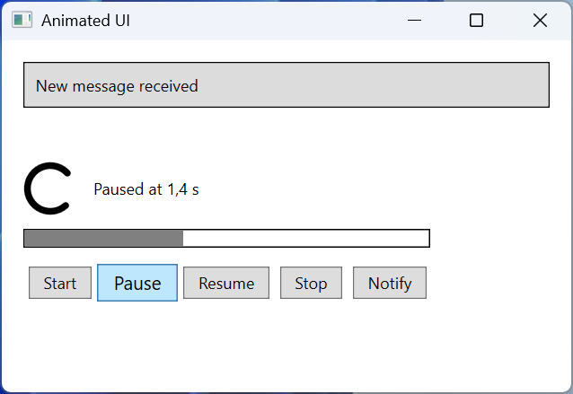
Fig. 14.5. The "Animated interface elements" application
Easing functions and keyframes
Easing functions
A linear animation changes the value uniformly and looks mechanical. An easing function changes the character of the motion: acceleration, deceleration, a bounce, elastic oscillations (Fig. 14.6) (https://learn.microsoft.com/dotnet/desktop/wpf/graphics-multimedia/easing-functions). It is assigned to the animation's EasingFunction property. The EasingMode property determines which part of the motion the effect applies to: EaseIn – at the start, EaseOut (the default) – at the end, EaseInOut – at both ends.
Fig. 14.6. Easing functions: IEasingFunction.Ease values from WPF
The most commonly used functions: QuadraticEase, CubicEase, QuarticEase, QuinticEase (acceleration and deceleration of different strength), SineEase, CircleEase, ExponentialEase, BackEase (a small pull back), BounceEase (bounces; Bounces is 3 by default), ElasticEase (elastic oscillations around the final value; Oscillations is 3). The ElasticEase function overshoots the final value (up to 1.62 in the figure), so it is not used for opacity, which cannot be greater than 1.
Key-frame animation
A basic animation has only two values. A key-frame animation passes through any number of values at the given KeyTime; the way of moving to each frame is determined by the frame class (https://learn.microsoft.com/dotnet/desktop/wpf/graphics-multimedia/key-frame-animations-overview):
LinearDoubleKeyFrame– a uniform transition;DiscreteDoubleKeyFrame– a jump at theKeyTimemoment;SplineDoubleKeyFrame– a transition along aKeySplineBézier curve;EasingDoubleKeyFrame– a transition with an easing function.
xml
<DoubleAnimationUsingKeyFrames Storyboard.TargetName="box"
                               Storyboard.TargetProperty="Width">
    <LinearDoubleKeyFrame Value="100" KeyTime="0:0:1"/>
    <DiscreteDoubleKeyFrame Value="50" KeyTime="0:0:2"/>
    <SplineDoubleKeyFrame Value="150" KeyTime="0:0:3"
                          KeySpline="0.5,0 1,1"/>
    <EasingDoubleKeyFrame Value="0" KeyTime="0:0:4">
        <EasingDoubleKeyFrame.EasingFunction>
            <BounceEase EasingMode="EaseOut"/>
        </EasingDoubleKeyFrame.EasingFunction>
    </EasingDoubleKeyFrame>
</DoubleAnimationUsingKeyFrames>
For a rectangle with an initial width of 0, WPF gave the values: 50 after 0.5 s, 100 after 1 s and 1.99 s, 50 after 2 s, 77.8 after 2.5 s, 150 after 3 s, and 0 after 4 s. Between 1 and 2 s the width does not change and jumps to 50 only at the 2 s moment (a discrete frame), while between 2 and 3 s it grows first slowly and then quickly (a spline). Discrete frames are the only way to animate properties without interpolation, for example StringAnimationUsingKeyFrames for text or ObjectAnimationUsingKeyFrames for Visibility.
A path animation (DoubleAnimationUsingPath, MatrixAnimationUsingPath) takes values from a PathGeometry: the object moves along the curve, and with DoesRotateWithTangent="True" it also turns in the direction of motion (https://learn.microsoft.com/dotnet/desktop/wpf/graphics-multimedia/path-animations-overview).
Complex storyboards are convenient to create visually in Blend for Visual Studio, a component of the Visual Studio 2026 .NET desktop development workload: the View → Design in Blend… command opens the project, and the Objects and Timeline window shows a timeline with keyframes (https://learn.microsoft.com/visualstudio/xaml-tools/creating-a-ui-by-using-blend-for-visual-studio). The result is still written to XAML as a Storyboard.