
English
Collections, styles, and templates
Collections and data templates
Collections with notifications
List elements (ListBox, ComboBox, ListView, DataGrid) derive from ItemsControl and receive data through the ItemsSource property. For the on-screen list to update after Add and Remove, the collection must implement the INotifyCollectionChanged interface. The ready-made implementation is ObservableCollection<T> (the System.Collections.ObjectModel namespace); an ordinary List<T> is displayed only once. The Count property of this collection also reports changes, so {Binding Items.Count} is updated automatically. Changes to the properties of the items themselves are visible only when the item class implements INotifyPropertyChanged.
The DisplayMemberPath property shows one property of each item, and SelectedItem (a TwoWay binding) the selected item. The look of an item is fully defined by a data template DataTemplate assigned to the ItemTemplate property (https://learn.microsoft.com/dotnet/desktop/wpf/data/data-templating-overview). Inside the template, the data context is the collection item itself. A template with a DataType attribute and no key in the resources is applied automatically to all objects of that type (this is how navigation between pages is built, see below).
Collection views
Between a collection and a list element, WPF creates a collection view – an object with the ICollectionView interface that sorts, filters, and groups items without changing the collection itself (https://learn.microsoft.com/dotnet/api/system.componentmodel.icollectionview). The default view is returned by CollectionViewSource.GetDefaultView(collection):
Filter– aPredicate<object>delegate that decides whether to show an item; after the condition changes,Refresh()is called;SortDescriptions– a list ofSortDescription(property, direction);GroupDescriptions–PropertyGroupDescription(property); group headers are described by the list element'sGroupStyle.
The same settings can be specified in XAML through a CollectionViewSource resource (https://learn.microsoft.com/dotnet/desktop/wpf/data/how-to-sort-and-group-data-using-a-view-in-xaml). For tabular data there is DataGrid: it creates columns from properties itself (AutoGenerateColumns) or uses declared DataGridTextColumn, DataGridCheckBoxColumn columns.
Example: a product catalog
The catalog shows products grouped by category and sorted by name, filters them by search text, and shows the price of the selected product.
cs
using System.Collections.ObjectModel;
using System.ComponentModel;
using System.Windows.Data;

namespace Catalog;

public record Product(string Name, string Category,
    decimal Price, int Stock);

public class CatalogViewModel : ObservableObject
{
    public CatalogViewModel()
    {
        Products =
        [
            new("Laptop 14\"", "Computers", 32999m, 4),
            new("Mouse", "Accessories", 649.5m, 25),
            new("Monitor 27\"", "Computers", 11499m, 0),
            new("Keyboard", "Accessories", 1299m, 12),
            new("USB-C Hub", "Accessories", 899m, 7)
        ];
        ProductsView = CollectionViewSource.GetDefaultView(Products);
        ProductsView.Filter = Matches;
        ProductsView.GroupDescriptions.Add(
            new PropertyGroupDescription(nameof(Product.Category)));
        ProductsView.SortDescriptions.Add(new SortDescription(
            nameof(Product.Name), ListSortDirection.Ascending));
    }

    public ObservableCollection<Product> Products { get; }

    public ICollectionView ProductsView { get; }

    public string SearchText
    {
        get;
        set
        {
            if (SetProperty(ref field, value))
            {
                ProductsView.Refresh();   // apply the filter
            }
        }
    } = "";

    public Product? SelectedProduct
    {
        get;
        set => SetProperty(ref field, value);
    }

    private bool Matches(object item) =>
        item is Product p && p.Name.Contains(SearchText,
            StringComparison.CurrentCultureIgnoreCase);
}
The window markup (the ObservableObject class is the same as in the profile; App.xaml.cs overrides Language as shown above):
xml
<Window x:Class="Catalog.MainWindow"
    xmlns="http://schemas.microsoft.com/winfx/2006/xaml/presentation"
    xmlns:x="http://schemas.microsoft.com/winfx/2006/xaml"
    xmlns:local="clr-namespace:Catalog"
    Title="Product Catalog" Width="420" Height="360">
    <Window.DataContext>
        <local:CatalogViewModel/>
    </Window.DataContext>
    <DockPanel Margin="10">
        <TextBox DockPanel.Dock="Top" Text="{Binding SearchText,
                 UpdateSourceTrigger=PropertyChanged, Delay=300}"/>
        <StackPanel DockPanel.Dock="Bottom" Margin="0,6,0,0"
                    DataContext="{Binding SelectedProduct}">
            <TextBlock Text="{Binding Name,
                       FallbackValue=Select a product}"/>
            <TextBlock Text="{Binding Price,
                       StringFormat=Price: {0:C}}"/>
        </StackPanel>
        <ListBox ItemsSource="{Binding ProductsView}"
                 SelectedItem="{Binding SelectedProduct}">
            <ListBox.GroupStyle>
                <GroupStyle>
                    <GroupStyle.HeaderTemplate>
                        <DataTemplate>
                            <TextBlock FontWeight="Bold"
                                       Text="{Binding Name}"/>
                        </DataTemplate>
                    </GroupStyle.HeaderTemplate>
                </GroupStyle>
            </ListBox.GroupStyle>
            <ListBox.ItemTemplate>
                <DataTemplate DataType="{x:Type local:Product}">
                    <StackPanel Orientation="Horizontal">
                        <TextBlock Text="{Binding Name}" Width="150"/>
                        <TextBlock Text="{Binding Price,
                                   StringFormat={}{0:N2}}"
                                   Width="80" TextAlignment="Right"/>
                        <TextBlock Text="{Binding Stock,
                                   StringFormat={}{0} pcs}"
                                   Margin="12,0,0,0"/>
                    </StackPanel>
                </DataTemplate>
            </ListBox.ItemTemplate>
        </ListBox>
    </DockPanel>
</Window>
The list contains the groups Accessories (Keyboard 1,299.00, Mouse 649.50, USB-C Hub 899.00) and Computers (with US regional settings). While no product is selected, the bottom panel's binding cannot be performed and the FallbackValue Select a product is shown; after the mouse is selected, it shows Mouse and Price: $649.50. Searching for o leaves four products out of five (Fig. 13.4).
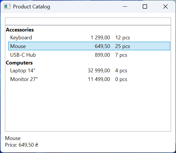
Fig. 13.4. A product catalog with filtering and grouping
Resources
Resources (Topic 12) are stored in ResourceDictionary dictionaries in the Resources properties of an element, a window, and the application. The {StaticResource Key} extension looks up the resource from the element up the tree to the application and system resources (Fig. 13.5) once, when the markup is loaded. {DynamicResource Key} keeps a reference to the key and updates the value if the resource with that key is replaced at run time; it is slightly slower and works only for dependency properties (https://learn.microsoft.com/dotnet/desktop/wpf/systems/xaml-resources-overview).
Fig. 13.5. Looking up a resource by key
Large sets of resources are moved into separate Resource Dictionary (WPF) files and merged in App.xaml with the MergedDictionaries property. If a key is repeated, the last added dictionary wins (https://learn.microsoft.com/dotnet/desktop/wpf/systems/xaml-resources-merged-dictionaries). This is how visual themes are implemented: the files Themes/Light.xaml and Themes/Dark.xaml contain brushes with the same keys, and the application replaces one dictionary with the other:
xml
<ResourceDictionary
    xmlns="http://schemas.microsoft.com/winfx/2006/xaml/presentation"
    xmlns:x="http://schemas.microsoft.com/winfx/2006/xaml">
    <SolidColorBrush x:Key="WindowBrush" Color="White"/>
    <SolidColorBrush x:Key="TextBrush" Color="#1E1E1E"/>
    <SolidColorBrush x:Key="AccentBrush" Color="#005A9E"/>
</ResourceDictionary>
The Dark.xaml file differs only in its colors (#202020, #F0F0F0, #4CA0E0). Elements that must change their look with the theme use DynamicResource.
Styles and triggers
A style (Style) is a named set of property values (Setter) for elements of one type TargetType (https://learn.microsoft.com/dotnet/desktop/wpf/controls/styles-templates-overview):
- a style with an
x:Keykey is applied explicitly:Style="{StaticResource WarningText}"; - a style without a key is implicit: it applies to all
TargetTypeelements within the scope of the resource; BasedOninherits another style; an implicit style has a type as its key, so it is referenced like this:BasedOn="{StaticResource {x:Type TextBlock}}";- a local attribute value on the element takes precedence over a style setter (Topic 12).
Triggers change properties based on a condition and undo the change when the condition stops being met: Trigger checks a property of the element itself, MultiTrigger checks several properties at once, and DataTrigger and MultiDataTrigger check a binding value (a ViewModel property or a data item). Animation in triggers (EventTrigger, BeginStoryboard) is covered in Topic 14.
xml
<Style x:Key="WarningText" TargetType="TextBlock"
       BasedOn="{StaticResource {x:Type TextBlock}}">
    <Setter Property="FontWeight" Value="Bold"/>
    <Style.Triggers>
        <Trigger Property="IsMouseOver" Value="True">
            <Setter Property="TextDecorations"
                    Value="Underline"/>
        </Trigger>
    </Style.Triggers>
</Style>
The WarningText style inherits the window's implicit text block style (in the example below it sets Foreground="{DynamicResource TextBrush}" and Margin="4") and adds bold text and an underline under the mouse cursor. A data trigger in a data template (DataTemplate.Triggers) can, for example, strike through the name of a product that is out of stock: <DataTrigger Binding="{Binding Stock}" Value="0"> with a setter whose TargetName property points to a named element inside the template.
Control templates
ControlTemplate
The logic and the look of a WPF control are separate: the Button class defines the behavior (the Click event, the IsPressed and IsMouseOver properties), while the visual tree is created by a control template ControlTemplate (Topic 12). By replacing the Template property, you can change the look completely while keeping the behavior (Fig. 13.6) (https://learn.microsoft.com/dotnet/desktop/wpf/controls/how-to-create-apply-template):
TemplateBinding– binds a property of a template element to a property of the control:Fill="{TemplateBinding Background}", so the button color is still set with theBackgroundproperty;ContentPresenter– the place where theContentis displayed;RecognizesAccessKey="True"handles the_Playmnemonic;ControlTemplate.Triggers– template triggers that change its elements byTargetName.
Fig. 13.6. A round button template
A style alone cannot change the look completely: the default button template replaces the background with a system color under the mouse cursor, ignoring Background.
Data templates can also be chosen programmatically: a class derived from DataTemplateSelector overrides the SelectTemplate(item, container) method and is assigned to the ItemTemplateSelector property. The panel that lays out the list items is set by an ItemsPanelTemplate (the ItemsPanel property, for example a WrapPanel instead of the default VirtualizingStackPanel) (https://learn.microsoft.com/dotnet/api/system.windows.controls.datatemplateselector).
Example: a stylish button
The application has two round buttons and a dark theme toggle. App.xaml merges the light theme dictionary and declares the button template and style:
xml
<Application x:Class="Styles.App"
    xmlns="http://schemas.microsoft.com/winfx/2006/xaml/presentation"
    xmlns:x="http://schemas.microsoft.com/winfx/2006/xaml"
    StartupUri="MainWindow.xaml">
    <Application.Resources>
        <ResourceDictionary>
            <ResourceDictionary.MergedDictionaries>
                <ResourceDictionary Source="Themes/Light.xaml"/>
            </ResourceDictionary.MergedDictionaries>

            <ControlTemplate x:Key="RoundTemplate"
                             TargetType="Button">
                <Grid>
                    <Ellipse x:Name="circle"
                             Fill="{TemplateBinding Background}"
                             Stroke="{DynamicResource TextBrush}"/>
                    <ContentPresenter RecognizesAccessKey="True"
                                      HorizontalAlignment="Center"
                                      VerticalAlignment="Center"/>
                </Grid>
                <ControlTemplate.Triggers>
                    <Trigger Property="IsMouseOver" Value="True">
                        <Setter TargetName="circle"
                                Property="StrokeThickness" Value="4"/>
                    </Trigger>
                    <Trigger Property="IsPressed" Value="True">
                        <Setter TargetName="circle"
                                Property="Opacity" Value="0.6"/>
                    </Trigger>
                </ControlTemplate.Triggers>
            </ControlTemplate>

            <Style x:Key="RoundButton" TargetType="Button">
                <Setter Property="Width" Value="90"/>
                <Setter Property="Height" Value="90"/>
                <Setter Property="Margin" Value="8"/>
                <Setter Property="Foreground" Value="White"/>
                <Setter Property="Background"
                        Value="{DynamicResource AccentBrush}"/>
                <Setter Property="Template"
                        Value="{StaticResource RoundTemplate}"/>
            </Style>
        </ResourceDictionary>
    </Application.Resources>
</Application>
The MainWindow.xaml window has Background="{DynamicResource WindowBrush}", and its resources contain an implicit TextBlock style and the WarningText style from the previous section. It contains three text blocks (one with Foreground="{StaticResource TextBrush}"), the buttons <Button Content="_Play" Style="{StaticResource RoundButton}"/> and Stop with Background="Gray", and a darkThemeBox check box (Dark theme) with a Click handler.
Switching the theme is a purely visual action, so its handler can live in the code-behind. It replaces the theme dictionary, and all DynamicResource references are updated:
cs
private void DarkThemeBox_Click(object sender, RoutedEventArgs e)
{
    string name =
        darkThemeBox.IsChecked == true ? "Dark" : "Light";
    var theme = new ResourceDictionary
    {
        Source = new Uri($"Themes/{name}.xaml", UriKind.Relative)
    };
    Application.Current.Resources.MergedDictionaries[0] = theme;
}
In the light theme, the Play button has the color #005A9E and Stop is gray: the local Background overrides the style setter, and the template picks it up through TemplateBinding. After Dark theme is turned on, the background becomes #202020, the text and outlines #F0F0F0, while the text Static: keeps the first brush stays dark and disappears on the dark background: StaticResource does not track the dictionary replacement (Fig. 13.7).
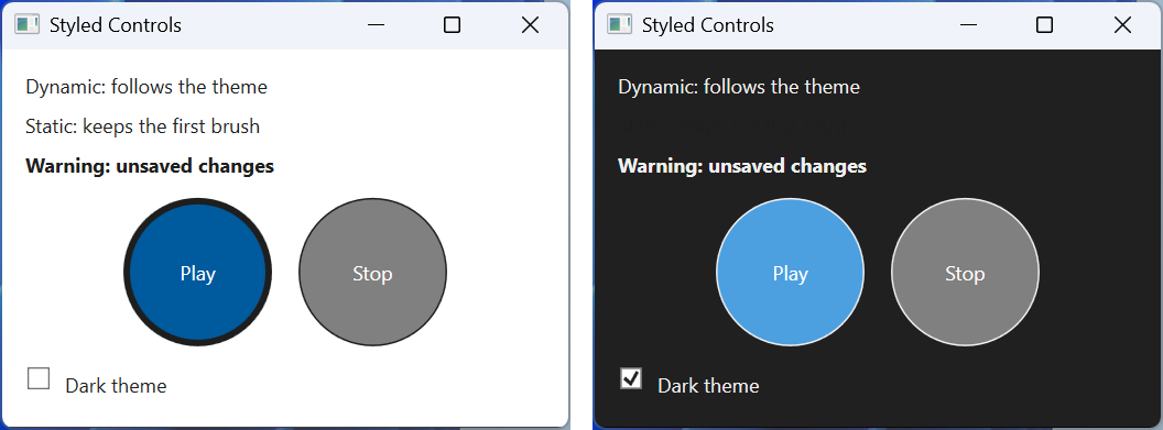
Fig. 13.7. Styled controls in the light and dark themes