
English
Commands, windows, and the Fluent theme
Commands, resources, and binding
Built-in commands
A single action ("Save") is often available from the menu, the toolbar, and the keyboard, and when there is nothing to save, all three must be disabled. Commands separate an action from the elements that invoke it (https://learn.microsoft.com/dotnet/desktop/wpf/advanced/commanding-overview). WPF has sets of ready-made commands: ApplicationCommands (New, Open, Save, Copy, Paste, Undo), EditingCommands, NavigationCommands, MediaCommands. A command has a name and standard keys (Save – Ctrl+S), and a CommandBinding links it to the Executed (execute) and CanExecute (is it available) handlers. Elements with a Command property (Button, MenuItem) disable themselves when CanExecute returns false, and a MenuItem takes its text and key gesture from the command. The Cut, Copy, and Paste commands are handled by the TextBox itself.
A fragment of a simple note editor window:
xml
<Window.CommandBindings>
    <CommandBinding Command="Open" Executed="Open_Executed"/>
    <CommandBinding Command="Save" Executed="Save_Executed"
                    CanExecute="Save_CanExecute"/>
</Window.CommandBindings>
<Window.InputBindings>
    <KeyBinding Key="F2" Command="Save"/>
</Window.InputBindings>
<DockPanel>
    <Menu DockPanel.Dock="Top">
        <MenuItem Header="_File">
            <MenuItem Command="Open"/>
            <MenuItem Command="Save"/>
        </MenuItem>
    </Menu>
    <ToolBar DockPanel.Dock="Top">
        <Button Command="Save" Content="Save"/>
    </ToolBar>
    <StatusBar DockPanel.Dock="Bottom">
        <StatusBarItem x:Name="statusItem"/>
    </StatusBar>
    <TextBox x:Name="editor" AcceptsReturn="True"
             TextChanged="Editor_TextChanged"/>
</DockPanel>
The CanExecute handler only reports whether the command is available, and Executed saves the file (through a SaveFileDialog if the name is not yet known) and resets the isModified flag:
cs
// The Save command is available only when there are unsaved changes.
private void Save_CanExecute(object sender,
    CanExecuteRoutedEventArgs e) => e.CanExecute = isModified;
The menu items show the names Open and Save with the gestures Ctrl+O and Ctrl+S, although no Header is set in the markup. Right after startup the Save button and menu item are disabled; after you type some text they become enabled, and the status bar shows Untitled* Characters: 22. You can save with the button, the menu item, Ctrl+S, or F2. CanExecute is called automatically after user actions; in more complex cases, commands with parameters are written as your own ICommand class (Topic 13).
Resources
Resources are named objects (brushes, numbers, styles, templates) declared in the Resources property of an element, a window, or the application (App.xaml) with an x:Key key (https://learn.microsoft.com/dotnet/desktop/wpf/systems/xaml-resources-overview). The {StaticResource} extension looks for the resource from the element up the logical tree to the application and theme resources; {DynamicResource} updates the value if the resource is replaced at run time (Topic 13).
xml
<Window.Resources>
    <SolidColorBrush x:Key="AccentBrush" Color="SteelBlue"/>
    <sys:Double x:Key="HeaderSize">20</sys:Double>
</Window.Resources>
<StackPanel Margin="10">
    <TextBlock Text="Photo Viewer"
               FontSize="{StaticResource HeaderSize}"
               Foreground="{StaticResource AccentBrush}"/>
    <Image x:Name="logoImage" Source="Images/logo.png"
           Height="48" HorizontalAlignment="Left"/>
</StackPanel>
The sys prefix is declared in the window root with the xmlns:sys attribute for the System namespace of the System.Runtime assembly, and the Icon attribute sets the window icon. In code, a resource is obtained with the FindResource("AccentBrush") method.
Image, icon, and font files are embedded in the assembly with the Resource build action (the file's Properties window → Build Action), which adds a <Resource Include="Images\logo.png" /> element to the project file. Without this, startup ends with a XamlParseException with the message Cannot locate resource 'images/logo.png'. The relative path Images/logo.png in XAML is resolved relative to the assembly that contains the markup. In code, a pack URI is used (https://learn.microsoft.com/dotnet/desktop/wpf/app-development/pack-uris-in-wpf); for a resource from another assembly, the path looks like /Snippets;component/Images/logo.png:
cs
var uri = new Uri("pack://application:,,,/Images/logo.png");
logoImage.Source = new BitmapImage(uri);
Windows and dialogs
A window is an object of the Window class (Project → Add Window (WPF)…). It is shown (https://learn.microsoft.com/dotnet/desktop/wpf/windows/):
Show()– modeless; the method returns control immediately;ShowDialog()– modal; the method returnsbool?:trueif the dialog assignedDialogResult = true, andfalseafter cancellation or closing.
The Owner property sets the owner window: the dialog appears above it (the CenterOwner value of the WindowStartupLocation property) and is minimized together with it. Assigning DialogResult closes a modal window, and a button with IsCancel closes it with the result false without any code.
The InputDialog name entry dialog sizes itself to its content (SizeToContent), has a fixed size (ResizeMode), does not appear on the taskbar (ShowInTaskbar), and contains a promptLabel label, an answerBox field, and the OK (IsDefault, the Ok_Click handler) and Cancel (IsCancel) buttons. The dialog code:
cs
public partial class InputDialog : Window
{
    public InputDialog(string prompt, string answer)
    {
        InitializeComponent();
        promptLabel.Content = prompt;
        answerBox.Text = answer;
        answerBox.SelectAll();
    }

    public string Answer => answerBox.Text.Trim();

    private void Ok_Click(object sender, RoutedEventArgs e)
    {
        if (Answer.Length > 0)
        {
            DialogResult = true;       // closes the modal window
        }
    }
}
The main window creates the dialog with new InputDialog("_New name:", "notes.txt") { Owner = this } and checks dialog.ShowDialog() == true, after which it reads dialog.Answer. If you enter report.txt and click OK, ShowDialog returns True and Answer returns report.txt. With an empty field, OK does not close the dialog, and Cancel or Esc returns False.
The WPF common dialogs are located in the Microsoft.Win32 namespace: OpenFileDialog, SaveFileDialog, and, starting with .NET 8, OpenFolderDialog (folder selection, the FolderName property) (https://learn.microsoft.com/dotnet/api/microsoft.win32.openfolderdialog). Their ShowDialog(this) method also returns bool?, and the selected path is in the FileName and FolderName properties; the file filter is set the same way as in Windows Forms: Filter = "Text files (*.txt)|*.txt|All files (*.*)|*.*".
MessageBox.Show(text, caption, MessageBoxButton.YesNo, MessageBoxImage.Question) shows a message and returns a MessageBoxResult. .NET 10 added the RetryCancel, AbortRetryIgnore, and CancelTryContinue buttons. The main menu is built from Menu and MenuItem, a context menu with the ContextMenu property, a toolbar with a ToolBar in a ToolBarTray, and a status bar with a StatusBar (the example above).
The Fluent theme
By default, WPF elements have the classic Windows look (the Aero2 theme), and that is what the lecture examples use. .NET 9 added the Fluent theme in the Windows 11 style to WPF, with light and dark modes and the system accent color (https://learn.microsoft.com/dotnet/desktop/wpf/whats-new/net90). It is enabled with the ThemeMode property of the application or of an individual window, with the values None (the classic theme), Light, Dark, and System (as in the Windows settings):
<Application … StartupUri="MainWindow.xaml" ThemeMode="System"> in the App.xaml file.
In .NET 10 the Fluent theme was extended with styles for DatePicker, GridSplitter, GroupBox, Label, TextBox, and other elements, but the ThemeMode property is still marked as experimental (the Experimental("WPF0001") attribute). The XAML attribute builds without warnings, but accessing ThemeMode in C# code gives compile error WPF0001 (ThemeMode is for evaluation purposes only and is subject to change or removal in future updates). To switch the theme from code, the diagnostic is disabled with a #pragma directive or in the project file (<NoWarn>$(NoWarn);WPF0001</NoWarn>):
cs
#pragma warning disable WPF0001   // ThemeMode is an experimental API
    private void DarkTheme_Click(object sender, RoutedEventArgs e) =>
        Application.Current.ThemeMode = darkThemeBox.IsChecked == true
            ? ThemeMode.Dark : ThemeMode.Light;
#pragma warning restore WPF0001
Fluent theme elements are taller and have larger margins than the classic ones (Fig. 12.10), so a window with a fixed height may clip its content: use SizeToContent, MinHeight, and Auto rows. The API may change in future versions, so for educational and enterprise applications on .NET 10, the classic theme remains the safe choice.
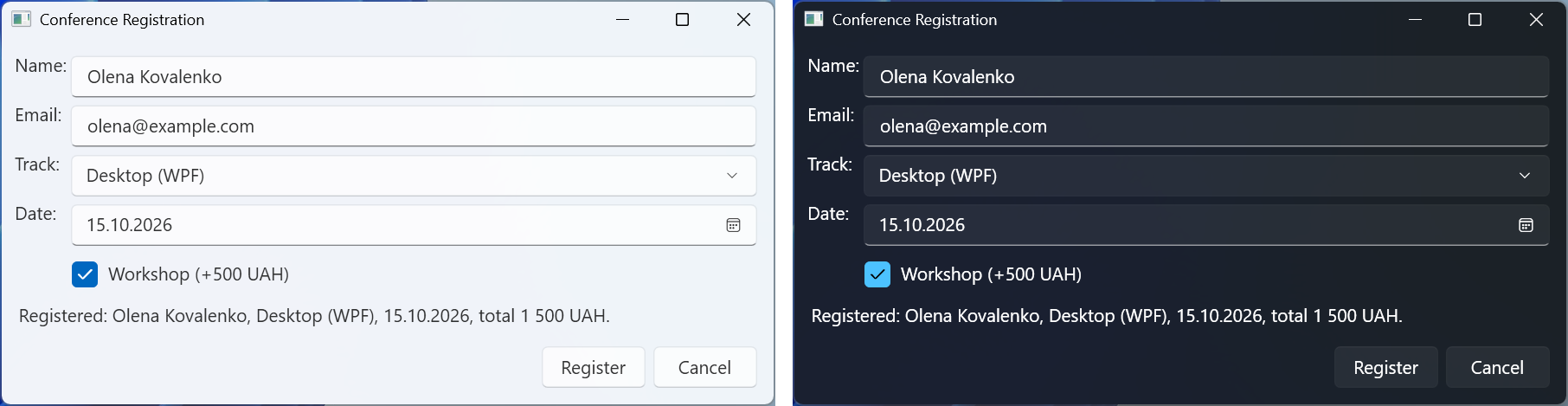
Fig. 12.10. The registration form in the Fluent theme: light and dark modes