
English
WPF, XAML, and element trees
The WPF technology and its architecture
Windows Presentation Foundation (WPF) is a technology for building Windows desktop applications in which the interface is described with the declarative XAML markup language and the behavior is programmed in C#. WPF appeared in 2006 in .NET Framework 3.0; the modern version is part of .NET, is open source, and runs only on Windows (https://learn.microsoft.com/dotnet/desktop/wpf/overview/).
The main differences between WPF and Windows Forms (Topic 3) are given in Table 12.1. Windows Forms "wraps" standard Windows windows and draws them with GDI/GDI+, while WPF draws the whole interface itself through DirectX. So a WPF button can contain an image, a table, or another button, any element can be rotated, scaled, or animated, and the look of elements can be changed completely with styles and templates.
Table 12.1. Comparison of Windows Forms and WPF
| Feature | Windows Forms | WPF |
|---|---|---|
| interface description | C# code in *.Designer.cs | XAML markup (*.xaml) |
| rendering | GDI/GDI+, Windows windows | DirectX, vector graphics |
| size units | screen pixels | device-independent units (1/96 inch) |
| positioning | coordinates, Anchor, Dock | layout panels, size to content |
| appearance | color and font properties | styles, templates, themes |
The basic WPF unit of size is the device-independent pixel, which equals 1/96 inch. Width="96" takes 96 physical pixels on a screen at 100 % scale and 144 at 150 %, so the interface is equally sharp on ordinary and high-resolution monitors. Coordinates and sizes are of type double.
The WPF architecture is shown in Fig. 12.1 (https://learn.microsoft.com/dotnet/desktop/wpf/advanced/wpf-architecture). An application works with managed assemblies: PresentationFramework (windows, controls, panels, styles, data binding), PresentationCore (visual objects, input, routed events), and WindowsBase (dependency properties, the thread dispatcher). Below them is the unmanaged milcore component, written for tight integration with DirectX: it composes the image and passes it to the graphics adapter.
Fig. 12.1. WPF architecture
WPF uses retained-mode rendering. In Windows Forms the program itself draws in the Paint handler every time the window needs to be updated (Topic 4). In WPF the program creates a tree of objects (Button, Ellipse, TextBlock), and the system keeps their drawing instructions and redraws the window without the user's code. To change the picture, it is enough to change an object's property, for example ellipse.Width = 50.
A WPF project
Creating a project
You need the .NET desktop development workload in Visual Studio 2026. A project is created as follows (https://learn.microsoft.com/dotnet/desktop/wpf/get-started/create-app-visual-studio):
- File → New → Project… or Create a new project in the start window.
- In the Search for templates field, type
wpf, choose the C# language and the WPF Application template (not WPF Application (.NET Framework)). - Set the Project name and Location and click Next.
- In the Additional information window, choose Framework: .NET 10.0 (Long Term Support) and click Create.
The same project is created by the command dotnet new wpf -n Registration. The project file differs from Windows Forms only in the <UseWPF>true</UseWPF> property instead of UseWindowsForms (the target framework is still net10.0-windows, the output type WinExe). Implicit using directives for WPF do not add the System.Windows… namespaces, so the template writes them explicitly at the top of the code files.
Project files
The template creates the following files:
App.xamlandApp.xaml.cs– theAppapplication class derived fromApplication. TheStartupUri="MainWindow.xaml"attribute sets the window that opens at startup, and theApplication.Resourcessection holds application-wide resources. TheMainmethod is generated by the compiler;MainWindow.xaml– the markup of the main window;MainWindow.xaml.cs– the window's code-behind: the constructor and event handlers;AssemblyInfo.cs– theThemeInfoattribute, needed for custom controls with themes.
The MainWindow.xaml template contains the root Window element with an x:Class attribute, xmlns namespaces, and an empty Grid panel inside.
The x:Class attribute links the markup to the Registration.MainWindow class. During the build, the XAML compiler converts the markup into the binary BAML format (embedded in the assembly) and generates the MainWindow.g.cs file with the second part of the class: fields for named elements and the InitializeComponent method. That is why the class in MainWindow.xaml.cs is declared with the partial modifier, and its constructor calls InitializeComponent(), which loads the markup, creates the objects, and subscribes the event handlers:
cs
public partial class MainWindow : Window
{
    public MainWindow()
    {
        InitializeComponent();
    }
}
Unlike *.Designer.cs in Windows Forms, XAML markup is usually written and edited by hand: the XAML editor suggests elements, attributes, and values (IntelliSense), and the XAML designer shows the result immediately (Fig. 12.2). Elements can be dragged from the Toolbox, but then the designer adds fixed Margin, Width, and Height values that get in the way of layout.
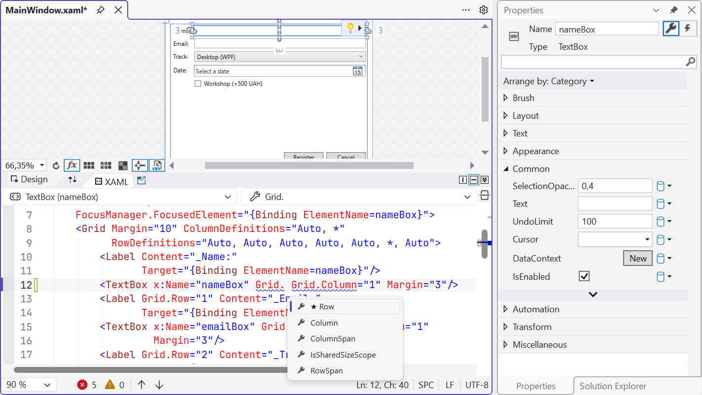
Fig. 12.2. The XAML designer and editor in Visual Studio 2026
The XAML markup language
XAML (Extensible Application Markup Language) is an XML-based language in which each element creates an object of a class, and each attribute sets a property or subscribes an event handler (https://learn.microsoft.com/dotnet/desktop/wpf/xaml/). At run time, the markup from Fig. 12.3 produces the same result as the C# code shown on the right.
Fig. 12.3. Correspondence between XAML markup and C# code
Syntax rules:
- XAML is case-sensitive:
<Button>, not<button>; every element is closed (<TextBox/>or<Button>…</Button>); - XML namespaces:
xmlnswithout a prefix corresponds to WPF elements,xmlns:xto XAML language constructs (x:Class,x:Name,x:Key,x:Static), andxmlns:local="clr-namespace:…"to classes of your own project (<local:StarRatingControl/>); x:Namegives an element a name: a field appears in the window class that is accessible in the code-behind;- type converters convert an attribute string to the required type:
Margin="5,0,0,0"toThickness,Background="LightGray"toSolidColorBrush,Width="Auto"todouble.NaN; - the property element syntax
<Type.Property>sets a complex value that cannot be written as a string; - the content property: a nested element without a wrapper goes into the property marked with the
ContentPropertyattribute, for example into a button'sContentor a panel'sChildren; - attached properties such as
Grid.Row="1"andDockPanel.Dock="Top"are declared in another class (the parent panel) and set on the child element.
For example, <Button.ToolTip><ToolTip Content="Save"/></Button.ToolTip> inside <Button> is a property element, while a nested <StackPanel> with an Ellipse circle and a TextBlock label is the button's content: in WPF a button can contain any tree of elements.
Markup extensions are written in curly braces. They compute a value when the markup is loaded or later:
{StaticResource AccentBrush}– a resource by key (the "Resources" section);{x:Static SystemColors.GrayTextBrush}– the value of a static class member;{Binding Value, ElementName=bookRating}– data binding (covered in detail in Topic 13);{x:Null}– thenullvalue.
To write text in an attribute that begins with {, put {} before it: Text="{}{0}".
The logical and visual trees
WPF interface elements form a tree (Fig. 12.4) (https://learn.microsoft.com/dotnet/desktop/wpf/advanced/trees-in-wpf). The logical tree corresponds to the markup: the window contains a Grid, the Grid contains a button, the button contains the string "OK". The logical tree determines property value inheritance (for example, FontSize) and resource lookup. The visual tree contains everything that is actually drawn: the button template (ControlTemplate) creates a Border, a ContentPresenter, and a TextBlock. The visual tree determines the event route and mouse hit testing. The trees are traversed with the LogicalTreeHelper and VisualTreeHelper classes.
Fig. 12.4. The logical and visual trees of a window with a button (dashed line – the same Button object)
XAML debugging tools
During debugging (F5, the Debug configuration), Visual Studio 2026 shows an in-app toolbar above the application window and gives access to the following tools (https://learn.microsoft.com/visualstudio/xaml-tools/inspect-xaml-properties-while-debugging):
- Live Visual Tree (Debug → Windows → Live Visual Tree) – the visual tree of the running window. The Show Just My XAML button switches between the elements from your markup and the full tree with templates. The Select Element in the Running Application mode finds in the tree the element you clicked in the application window, and Display Layout Adorners shows its bounds and margins;
- Live Property Explorer – the actual property values of the selected element with the value source (local, style, inherited, default); values can be changed right while the application runs (Fig. 12.5);
- XAML Hot Reload – markup changes are applied to the running application after the file is saved, without a restart and with the window state preserved (https://learn.microsoft.com/visualstudio/xaml-tools/xaml-hot-reload). C# code changes are applied by .NET Hot Reload (the flame button on the Visual Studio toolbar), but some changes (a new class, a signature change) require a restart.
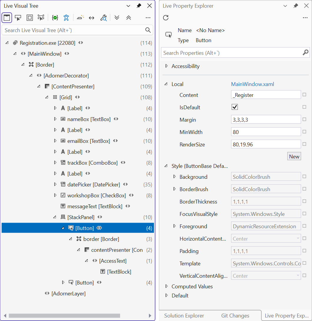
Fig. 12.5. Live Visual Tree and Live Property Explorer