
English
Layout and input validation
Laying out controls
Placing controls at fixed coordinates is simple, but after the window is maximized the controls stay in the upper-left corner, and a large font or another interface language truncates the labels. Windows Forms has several layout tools (https://learn.microsoft.com/dotnet/desktop/winforms/controls/layout).
Anchor and Dock
The Anchor property attaches a control to the edges of its parent: when the form is resized, the distance to the anchored edges does not change (Fig. 3.8). By default, Anchor = Top, Left: the control stays in place. Anchoring to Top, Right moves a button together with the right edge, and Top, Left, Right stretches an input field across the full width.
The Dock property docks a control to an edge (Top, Bottom, Left, Right) or fills all the remaining space (Fill). This is how the menu, toolbar, and status bar (Top, Bottom) and the main content of the window (Fill) are placed. Docked controls take up space in the reverse order of the Controls collection (Z-order), so the control with Fill must be first in the collection; if it covers a panel, run the Bring to Front command on it.
Figure 3.8. Anchor and Dock before and after resizing the form
The Margin property sets a control's outer spacing from its neighbors, and Padding sets the inner spacing between the border and the content. The MinimumSize and MaximumSize properties limit the size, and AutoSize = true fits the size of a label or button to its text.
Layout panels
Layout panels position their child controls themselves:
FlowLayoutPanel—places controls one after another in a row or column (FlowDirection) and wraps them when there is not enough room;TableLayoutPanel—a table with rows and columns; the size of a row or column is set in absolute units (Absolute), as a percentage (Percent), or by content (AutoSize). A control can span several cells (ColumnSpan,RowSpan);SplitContainer—two panels with a splitter that the user drags with the mouse.
In the designer, the rows and columns of a TableLayoutPanel are configured through the smart tag menu (the triangle in the upper-right corner of the panel) → Edit Rows and Columns… (Fig. 3.9). The same "label – field" form is easy to create in code as well: the first column fits the longest label (SizeType.AutoSize), the second takes the rest of the width (SizeType.Percent, 100%), and controls without explicitly specified rows fill the cells left to right and top to bottom:
cs
public LayoutForm()
{
    var table = new TableLayoutPanel
    {
        Dock = DockStyle.Fill,
        ColumnCount = 2,
        Padding = new Padding(10)
    };
    table.ColumnStyles.Add(new ColumnStyle(SizeType.AutoSize));
    table.ColumnStyles.Add(new ColumnStyle(SizeType.Percent, 100));
    AddRow("&Name:", new TextBox { Dock = DockStyle.Fill });
    AddRow("&Email:", new TextBox { Dock = DockStyle.Fill });
    AddRow("&Track:", new ComboBox { Dock = DockStyle.Fill });
    Controls.Add(table);

    void AddRow(string caption, Control control)
    {
        table.Controls.Add(new Label
        {
            Text = caption,
            AutoSize = true,
            Anchor = AnchorStyles.Left   // vertically centered in the row
        });

        table.Controls.Add(control);
    }
}
If the form's client area is 300 pixels wide, the fields are 226 pixels wide, and after the window is widened to 520 pixels, they are 430: the labels stay in place, and the fields stretch.
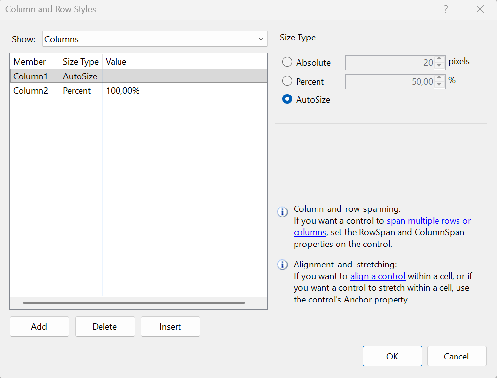
Figure 3.9. Configuring the rows and columns of a TableLayoutPanel
Scaling and high DPI
Modern monitors use 125–200% scaling. The form property AutoScaleMode = Font (the designer's default) scales the form and controls in proportion to the size of the system font, and AutoScaleDimensions stores the font size with which the form was created (for 100% scaling—new SizeF(7F, 15F)). The application's high-DPI mode is set by the ApplicationHighDpiMode project property (SystemAware by default); the PerMonitorV2 value recalculates sizes when the window is moved to a monitor with a different scale (https://learn.microsoft.com/dotnet/desktop/winforms/whats-new/net60#project-level-application-settings). Layout panels and AutoSize make a form resilient to scaling changes, so for forms with many fields they are better than fixed coordinates.
Validating input
A user can type anything into a field, so data is validated before use. Windows Forms provides validation events and the ErrorProvider component for this (https://learn.microsoft.com/dotnet/desktop/winforms/input-keyboard/validation).
The Validating and Validated events
When focus leaves a control (the Tab key or a click on another control), the Leave, Validating, and Validated events are raised. In the Validating handler, you check the value and, if it is invalid, set e.Cancel = true: focus stays in the field, and the Validated event is not raised.
The Validating event is raised only when moving to a control whose CausesValidation = true (the default). For a Cancel or Help button, set CausesValidation = false so the user can close the form without fixing the field. The form's ValidateChildren() method validates all controls at once and returns false if at least one failed validation: call it before saving or calculating.
The ErrorProvider component
ErrorProvider shows an error icon next to a control, and the error text in a tooltip when you hover over it. The SetError(control, message) method sets an error, and an empty string clears it. A single component serves all fields of the form (https://learn.microsoft.com/dotnet/api/system.windows.forms.errorprovider).
Example: temperature converter
The form contains the label celsiusLabel (Temperature, °C:), the field celsiusTextBox, the button convertButton (Convert, which is also the form's AcceptButton), the result label resultLabel, and the errorProvider component in the component tray. The field's Validating event and the button's Click event are subscribed in the Properties window. The form code:
cs
using System.ComponentModel;

namespace TemperatureConverter;

public partial class MainForm : Form
{
    private const double AbsoluteZero = -273.15;

    public MainForm()
    {
        InitializeComponent();
    }

    private void celsiusTextBox_Validating(object sender,
        CancelEventArgs e)
    {
        if (double.TryParse(celsiusTextBox.Text, out double c)
            && c >= AbsoluteZero)
        {
            errorProvider.SetError(celsiusTextBox, "");
        }
        else
        {
            errorProvider.SetError(celsiusTextBox,
                $"Enter a number not less than {AbsoluteZero}");
            e.Cancel = true;        // focus stays in the field
        }
    }

    private void convertButton_Click(object sender, EventArgs e)
    {
        if (!ValidateChildren())    // validate all fields of the form
        {
            return;
        }
        double celsius = double.Parse(celsiusTextBox.Text);
        double fahrenheit = celsius * 9 / 5 + 32;
        double kelvin = celsius - AbsoluteZero;
        resultLabel.Text = $"{fahrenheit:F1} °F    {kelvin:F2} K";
    }
}
The CancelEventArgs type is declared in the System.ComponentModel namespace. The button handler first calls ValidateChildren(): this way, the field is validated even when the user presses Enter without leaving the field.
With Ukrainian regional settings, for the input 25 the label shows 77,0 °F and 298,15 K, for 36,6—97,9 °F and 309,75 K, and for -273,15—−459,7 °F and 0,00 K. For abc, -300, and 36.6, an error icon with the tooltip Enter a number not less than -273,15 appears next to the field (Fig. 3.10): the double.TryParse method takes the regional settings into account, and a number with a period is invalid for them. With English (United States) settings, it is the other way around: the decimal separator is a period.
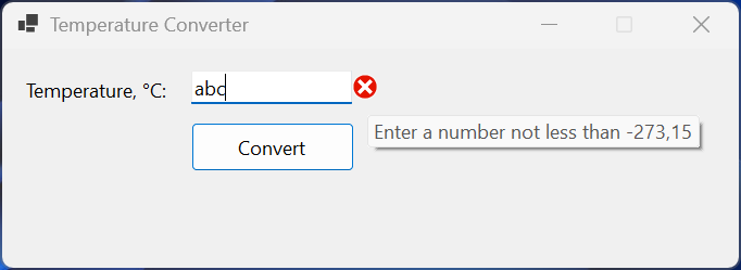
Figure 3.10. An input error in the temperature converter