
English
Layout and controls
The layout system
Measuring and arranging
WPF lays out elements in two passes (https://learn.microsoft.com/dotnet/desktop/wpf/advanced/layout). During measuring (Measure), the parent element asks each child how much space it needs (DesiredSize). During arranging (Arrange), it allocates a rectangle to each child (a layout slot). That is why a button by default has the size of its text, and after the interface is translated or the font is enlarged, the sizes are recalculated automatically.
The position of an element within its slot is set by properties of the FrameworkElement class:
Margin– the outer spacing: one number for all sides,"10,5"(left-right, top-bottom), or"5,0,0,0"(left, top, right, bottom);Padding– the inner spacing from the border to the content (inControl,Border,TextBlock);HorizontalAlignmentandVerticalAlignment–Left,Center,Right,Top,Bottom, orStretch(stretch across the whole slot, the default);Width,Height– an explicit size (the default isAuto, that is,double.NaN),MinWidth,MaxWidth– limits; the actual size after layout isActualWidth,ActualHeight.
A window with SizeToContent="WidthAndHeight" fits its size to the content, which is convenient for dialogs.
Layout panels
A panel is an element derived from Panel that arranges its Children collection according to its own rule (Fig. 12.6, https://learn.microsoft.com/dotnet/desktop/wpf/controls/panels-overview):
StackPanel– elements one after another vertically or horizontally (Orientation);WrapPanel– in a row, wrapping when there is not enough space (cards, thumbnails);DockPanel– along the edges:DockPanel.Dock="Top",Bottom,Left,Right; the last element fills the remaining space (LastChildFill="True"). The order of elements matters: first the menu, toolbar, and status bar, and the main content last;Grid– a table of rows and columns, the main panel for forms;UniformGrid– a table with equal cells (Rows,Columns): a keypad, a game board;Canvas– absolute coordinatesCanvas.Left,Canvas.Topfor graphics and diagrams.
Fig. 12.6. WPF layout panels
Panels are nested inside one another: a DockPanel for the window, a Grid for a form, a StackPanel for buttons. Besides panels, Border (a border and background around a single element), ScrollViewer (scrolling content larger than the window), and Viewbox (scales content to the available size) are often used.
The Grid panel
Grid rows are described with the RowDefinitions collection and columns with ColumnDefinitions. The height of a row (width of a column) is set in three ways:
Auto– by the largest element in the row;- a number – a fixed size in independent units;
*– a share of the remaining space: columns2*and3*divide the remainder in the ratio 2 : 3.
An element is placed with the attached properties Grid.Row, Grid.Column (numbered from 0, default 0) and Grid.RowSpan, Grid.ColumnSpan. The classic definition syntax uses the property elements <Grid.ColumnDefinitions> with nested <ColumnDefinition Width="Auto"/>; .NET 10 introduced a short form with a single attribute ColumnDefinitions="Auto, *" (https://learn.microsoft.com/dotnet/desktop/wpf/whats-new/net100). A GridSplitter lets the user change column widths with the mouse; it is placed in a separate Auto column:
xml
<Grid ColumnDefinitions="2*, Auto, 3*" RowDefinitions="Auto, *">
    <TextBlock Text="Folders" Margin="4"/>
    <TextBlock Grid.Column="2" Text="Preview" Margin="4"/>
    <ListBox x:Name="folderList" Grid.Row="1"/>
    <GridSplitter Grid.Row="1" Grid.Column="1" Width="5"
                  HorizontalAlignment="Stretch"/>
    <Image Grid.Row="1" Grid.Column="2" Stretch="Uniform"/>
</Grid>
For a window 484 units wide, the columns get 192, 5, and 287 units: the splitter takes 5, and the remainder is divided in the ratio 2 : 3.
Example: participant registration
The conference registration window contains name and email fields, a track drop-down list, a date, and a workshop check box. The labels occupy an Auto column and the fields a * column, so the fields stretch with the window; the message row has height * and takes the free space, and the buttons are pinned to the right edge. The _ character in the labels' Content sets an access key, and the Target property passes focus to the field: Alt+E moves the cursor to the email field. IsDefault="True" presses the Register button with the Enter key. MainWindow.xaml:
xml
<Window x:Class="Registration.MainWindow"
    xmlns="http://schemas.microsoft.com/winfx/2006/xaml/presentation"
    xmlns:x="http://schemas.microsoft.com/winfx/2006/xaml"
    Title="Conference Registration" Width="420" Height="320"
    MinWidth="360" MinHeight="300"
    WindowStartupLocation="CenterScreen"
    FocusManager.FocusedElement="{Binding ElementName=nameBox}">
    <Grid Margin="10" ColumnDefinitions="Auto, *"
          RowDefinitions="Auto, Auto, Auto, Auto, Auto, *, Auto">
        <Label Content="_Name:"
               Target="{Binding ElementName=nameBox}"/>
        <TextBox x:Name="nameBox" Grid.Column="1" Margin="3"/>
        <Label Grid.Row="1" Content="_Email:"
               Target="{Binding ElementName=emailBox}"/>
        <TextBox x:Name="emailBox" Grid.Row="1" Grid.Column="1"
                 Margin="3"/>
        <Label Grid.Row="2" Content="_Track:"
               Target="{Binding ElementName=trackBox}"/>
        <ComboBox x:Name="trackBox" Grid.Row="2" Grid.Column="1"
                  Margin="3" SelectedIndex="0">
            <ComboBoxItem Content="Desktop (WPF)"/>
            <ComboBoxItem Content="Web (ASP.NET Core)"/>
            <ComboBoxItem Content="Mobile (.NET MAUI)"/>
        </ComboBox>
        <Label Grid.Row="3" Content="_Date:"
               Target="{Binding ElementName=datePicker}"/>
        <DatePicker x:Name="datePicker" Grid.Row="3" Grid.Column="1"
                    Margin="3"/>
        <CheckBox x:Name="workshopBox" Grid.Row="4" Grid.Column="1"
                  Margin="3" Content="_Workshop (+500 UAH)"/>
        <TextBlock x:Name="messageText" Grid.Row="5"
                   Grid.ColumnSpan="2" Margin="3"
                   TextWrapping="Wrap"/>
        <StackPanel Grid.Row="6" Grid.ColumnSpan="2"
                    Orientation="Horizontal"
                    HorizontalAlignment="Right">
            <Button Content="_Register" IsDefault="True"
                    MinWidth="80" Margin="3" Click="Register_Click"/>
            <Button Content="_Cancel" IsCancel="True" MinWidth="80"
                    Margin="3" Click="Cancel_Click"/>
        </StackPanel>
    </Grid>
</Window>
The code-behind validates the input, shows errors in messageText, and calculates the participation fee. WPF event handlers have a second parameter of type RoutedEventArgs (the "Routed events" section):
cs
using System.Windows;
using System.Windows.Controls;

namespace Registration;

public partial class MainWindow : Window
{
    private const decimal BasePrice = 1000m, WorkshopPrice = 500m;

    public MainWindow()
    {
        InitializeComponent();
        datePicker.DisplayDateStart = DateTime.Today;
    }

    private void Register_Click(object sender, RoutedEventArgs e)
    {
        var errors = new List<string>();
        string name = nameBox.Text.Trim();
        string email = emailBox.Text.Trim();
        if (name.Length < 2)
        {
            errors.Add("Enter your name (at least 2 letters).");
        }
        if (!email.Contains('@') || email.EndsWith('@'))
        {
            errors.Add("Enter a valid email.");
        }
        if (datePicker.SelectedDate is not DateTime date
            || date < DateTime.Today)
        {
            errors.Add("Choose a date from today on.");
            date = default;
        }
        if (errors.Count > 0)
        {
            messageText.Text = string.Join("\n", errors);
            return;
        }

        var track = (ComboBoxItem)trackBox.SelectedItem;
        decimal price = BasePrice
            + (workshopBox.IsChecked == true ? WorkshopPrice : 0);
        messageText.Text = $"Registered: {name}, {track.Content}, "
            + $"{date:d}, total {price:N0} UAH.";
    }

    private void Cancel_Click(object sender, RoutedEventArgs e) =>
        Close();
}
The IsChecked property has the type bool? (a check box can have a third, indeterminate state), so it is compared with true. The date variable is assigned default in the error branch: after is not the compiler considers it unassigned. After clicking Register on an empty form, the message has three lines: Enter your name (at least 2 letters)., Enter a valid email., and Choose a date from today on.
For the name Olena Kovalenko, the email [email protected], the Desktop (WPF) track, the date October 15, 2026, and the workshop, the line Registered: Olena Kovalenko, Desktop (WPF), 10/15/2026, total 1,500 UAH. appears (with US regional settings), and the Cancel button (IsCancel="True", the Esc key) closes the window. If you widen the window, the fields stretch and the buttons stay at the right edge (Fig. 12.7).
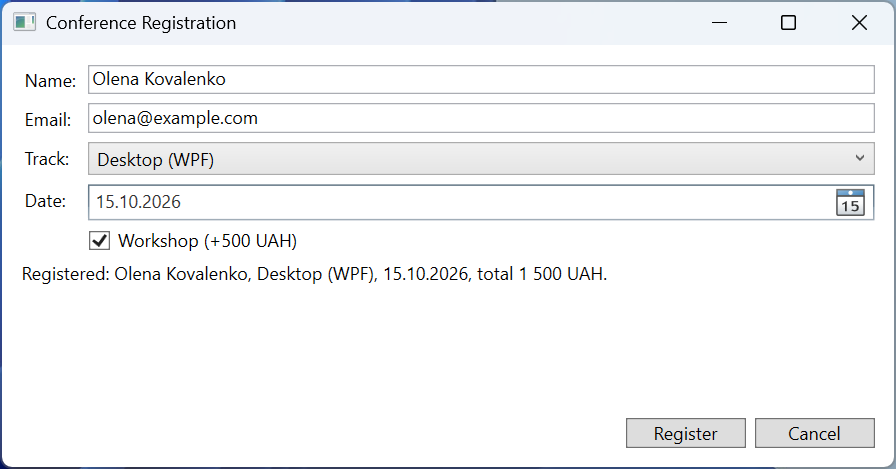
Fig. 12.7. A registration form on a Grid panel
Controls and the content model
WPF controls are divided by their content model – what and how much they can contain (https://learn.microsoft.com/dotnet/desktop/wpf/controls/):
- a
ContentControlhas one object in itsContentproperty:Button,CheckBox,RadioButton,Label,ToolTip,Window. A string is displayed as text, an element (StackPanel,Image) as is, and any other object as the result ofToString()(or with a data template, Topic 13); - a
HeaderedContentControladds aHeader:GroupBox,Expander,TabItem; - an
ItemsControlshows theItemsorItemsSourcecollection:ListBox,ComboBox,ListView,TreeView,TabControl,Menu; - the rest have their own properties:
TextBox.Text,PasswordBox.Password,Slider.Value,Image.Source.
The most commonly used controls are listed in Table 12.2.
Table 12.2. The main WPF controls
| Element | Purpose and properties | Event |
|---|---|---|
TextBlock, Label | text: Text (TextBlock, lightweight); Content and Target (Label, access key) | – |
TextBox | an input field: Text, AcceptsReturn, IsReadOnly, MaxLength | TextChanged |
Button | a button: Content, IsDefault, IsCancel, Command | Click |
CheckBox, RadioButton | IsChecked (bool?); radio buttons are grouped with GroupName or a common parent element | Checked, Click |
ComboBox, ListBox | Items, ItemsSource, SelectedItem, SelectedIndex | SelectionChanged |
Slider | Minimum, Maximum, Value (double), IsSnapToTickEnabled | ValueChanged |
TabControl, Expander | TabItem tabs; expansion with IsExpanded | SelectionChanged, Expanded |
ListView, TreeView | a GridView table; a TreeViewItem hierarchy | SelectionChanged, SelectedItemChanged |
In WPF an access key is marked with the _ character, not &: Content="_Save".