
English
Forms, controls, and events
The Control and Form classes
The control hierarchy
All controls derive from the Control class (Fig. 3.4). It defines common properties (location, size, text, colors, font), methods (Show, Hide, Focus, Invalidate), and events (Click, MouseMove, KeyDown, Paint). Each control is a separate Windows window and has a window handle, available through the Handle property. Windowless components (Timer, ErrorProvider, dialogs) derive only from Component. A form (Form) is also a control: it derives from ContainerControl, so it can contain other controls (the Controls collection) and manages input focus among them. The Location coordinates of a child control are specified in pixels relative to its parent (Parent), and the Y axis points down.
Figure 3.4. The control class hierarchy (the arrow points to the base class)
Common properties
The most frequently used properties of the Control class are listed in Table 3.2 (https://learn.microsoft.com/dotnet/api/system.windows.forms.control).
Table 3.2. Common control properties
| Property | Purpose |
|---|---|
Name | the name of the control (and of the form class field) |
Text | the control's text: a button caption, a field's content, a form title |
Location, Left, Top | position relative to the parent control |
Size, Width, Height | size in pixels |
BackColor, ForeColor | background and text color: Color.LightGreen |
Font | font: new Font("Segoe UI", 12F, FontStyle.Bold) |
Enabled | false—the control is visible but does not respond to the user |
Visible | false—the control is hidden |
TabIndex, TabStop | the Tab key order and participation in it |
Anchor, Dock | attachment to the edges of the parent control |
Tag | an arbitrary object associated with the control |
The tab order between fields is easy to check and change with the View → Tab Order command: the designer shows the TabIndex numbers on the controls, and you set them by clicking in sequence (https://learn.microsoft.com/dotnet/desktop/winforms/controls/how-to-set-the-tab-order-on-windows-forms).
Form properties determine the window's appearance and behavior: Text is the title, StartPosition is the initial position (CenterScreen, CenterParent), FormBorderStyle is the border (Sizable, FixedDialog), MinimizeBox and MaximizeBox are the minimize and maximize buttons, MinimumSize is the smallest size, AcceptButton and CancelButton are the buttons pressed by the Enter and Esc keys, and KeyPreview lets the form receive keys before its controls.
The form lifecycle
When a form is created, shown, and closed, it raises events in a strict order (Fig. 3.5) (https://learn.microsoft.com/dotnet/desktop/winforms/order-of-events-in-windows-forms). In the Load handler, you fill in fields and load data. In the FormClosing handler, setting e.Cancel = true cancels closing, and e.CloseReason reports the reason (the user, Windows shutdown, an Application.Exit call). After the main form's FormClosed, the application exits.
Figure 3.5. The form lifecycle
The order of events is easy to see if you subscribe to them in the form constructor and write messages to the debugger's Output window with the Debug.WriteLine method (the System.Diagnostics namespace):
cs
public MainForm()
{
    InitializeComponent();
    Load += (sender, e) => Trace("Load");
    Activated += (sender, e) => Trace("Activated");
    Shown += (sender, e) => Trace("Shown");
    FormClosing += (sender, e) =>
        Trace($"FormClosing, reason: {e.CloseReason}");
    FormClosed += (sender, e) => Trace("FormClosed");
}

private static void Trace(string text) =>
    Debug.WriteLine($"{DateTime.Now:HH:mm:ss.fff} {text}");
After starting (F5) and closing the form, the Output window contains the lines Load, Activated, Shown, FormClosing, reason: UserClosing, and FormClosed. The obsolete Closing and Closed events are marked with the Obsolete attribute in .NET 10 (warning WFDEV004): use FormClosing and FormClosed.
The event model
A console program determines the order of actions itself: it asks for data, calculates, and outputs the result. A GUI application is event-driven: after starting, it waits for user actions, and each action (a click, a key press, a text change) raises an event, to which an event handler responds (https://learn.microsoft.com/dotnet/desktop/winforms/forms/events).
Fig. 3.6 shows the path from a mouse click to a handler. Windows sends messages (WM_LBUTTONDOWN, WM_LBUTTONUP) to the UI thread's queue. The message loop started by the Application.Run method takes messages from the queue and passes them to the button's window. The button turns the message into a call to the OnClick method, which raises the Click event, and the event invokes all subscribed handlers through a delegate.
Figure 3.6. The Windows Forms event model
All handlers run on the UI thread one at a time. While a handler is running, the message loop is stalled: the window is not repainted and does not respond to clicks. So a handler must finish quickly, and long-running operations (downloading from the network, heavy calculations) are performed asynchronously (Topic 5).
Event handlers
An event in C# is a class member declared with the event keyword and a delegate type. Most Windows Forms events have the type EventHandler or EventHandler<TEventArgs>, so a handler has two parameters:
sender—the object that raised the event (a button, a field, a menu item);e—the event data:EventArgs(no data),MouseEventArgs(the mouse button and thee.X,e.Ycoordinates),KeyEventArgs(thee.KeyCodekey, thee.Control,e.Shift,e.Altmodifiers),FormClosingEventArgs,CancelEventArgs, and so on.
The easiest way to create a handler is in the designer. Double-clicking a control creates a handler for the default event: Click for a button, TextChanged for an input field, Load for a form. For other events, select the control, click the Events button in the Properties window, and double-click the event name (Fig. 3.7). The drop-down list next to the event name lets you choose an existing method with a compatible signature (https://learn.microsoft.com/dotnet/desktop/winforms/controls/how-to-add-an-event-handler).
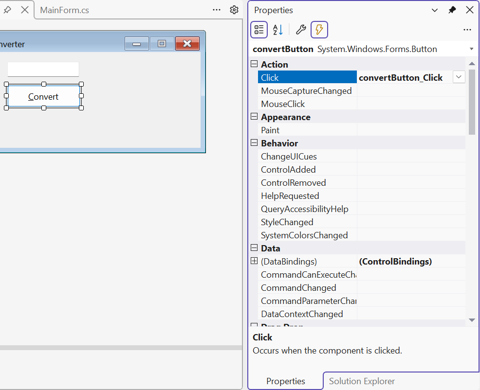
Figure 3.7. Button events in the Properties window
The designer adds a subscription to Designer.cs and an empty convertButton_Click method to MainForm.cs. To remove a handler, deleting the method is not enough: the subscription line remains in Designer.cs, and the project will not compile. Clear the event in the Properties window (the event name's context menu → Reset) or remove the subscription first.
Subscribing to events in code
Handlers can also be subscribed in code with the += operator (unsubscribe with -=). This is convenient for connecting one handler to several controls, using a lambda expression, or creating a control at run time.
The EventHandler delegate declares an object? sender parameter. Handlers created by the designer have an object sender parameter: they are subscribed in Designer.cs, where nullability checking is disabled for generated code. If you subscribe such a method in your own code, the compiler issues warning CS8622, so declare the handlers you subscribe yourself with object? sender.
An example of subscriptions in the form constructor:
cs
public MainForm()
{
    InitializeComponent();
    // One handler for three buttons.
    Button[] addButtons = [add1Button, add5Button, add10Button];
    foreach (Button b in addButtons)
    {
        b.Click += AddButton_Click;
    }
    // A lambda expression as a handler.
    resetButton.Click += (sender, e) => totalLabel.Text = "0";
    // Mouse coordinates are passed in MouseEventArgs.
    drawPanel.MouseMove += (sender, e) =>
        Text = $"X = {e.X}, Y = {e.Y}";
}

private void AddButton_Click(object? sender, EventArgs e)
{
    var button = (Button)sender!;  // the button that was clicked
    int step = int.Parse(button.Text);        // "+5" → 5
    int total = int.Parse(totalLabel.Text);
    totalLabel.Text = (total + step).ToString();
}
The buttons have the captions +1, +5, +10, and the shared handler determines the step from the caption of the sender button. After clicking "+5", "+10", "+1", the totalLabel label shows 16, and the Reset button resets it to 0. While the mouse moves over the drawPanel panel, the form title shows the cursor coordinates. The keyboard is handled with the KeyDown and KeyUp events (KeyEventArgs); if the form's KeyPreview property is true, the form receives keys before the control with focus.
Basic controls
The most frequently used controls from the Common Controls group of the Toolbox are listed in Table 3.3. The full list is in the documentation https://learn.microsoft.com/dotnet/desktop/winforms/controls/overview.
Table 3.3. Basic controls
| Control | Purpose and main properties | Main event |
|---|---|---|
Label | a label: Text, AutoSize, TextAlign | – |
TextBox | an input field: Text, Multiline, ReadOnly, MaxLength, PlaceholderText, UseSystemPasswordChar | TextChanged |
Button | a button: Text, DialogResult, Image | Click |
CheckBox | a check box: Checked, CheckState, ThreeState | CheckedChanged |
RadioButton | a radio button; radio buttons in one container form a group: Checked | CheckedChanged |
GroupBox, Panel | containers with or without a border and title | – |
ComboBox | a drop-down list: Items, SelectedIndex, SelectedItem, DropDownStyle | SelectedIndexChanged |
ListBox | a list: Items, SelectedItem, SelectionMode | SelectedIndexChanged |
NumericUpDown | a number with buttons: Value (decimal), Minimum, Maximum, DecimalPlaces, Increment | ValueChanged |
DateTimePicker | date and time: Value, MinDate, MaxDate, Format | ValueChanged |
PictureBox | an image: Image, ImageLocation, SizeMode | Click |
Controls with lists (ComboBox, ListBox) store any objects in the Items collection and display the result of the ToString() method for each. The DropDownStyle property set to DropDownList forbids entering text that is not in the list. An example of configuring controls in the form constructor:
cs
cityComboBox.DropDownStyle = ComboBoxStyle.DropDownList;
cityComboBox.Items.AddRange("London", "Madrid", "Brussels");
cityComboBox.SelectedIndex = 0;
cityComboBox.SelectedIndexChanged += (sender, e) =>
    visitedListBox.Items.Add(cityComboBox.SelectedItem!);

submitButton.Enabled = false;          // available only with consent
agreeCheckBox.CheckedChanged += (sender, e) =>
    submitButton.Enabled = agreeCheckBox.Checked;
The Text property of an input field is always of type string, so a number is obtained from it with the TryParse method and validation. If you need a number from a known range, NumericUpDown is more convenient: its Value property is already of type decimal and does not go beyond Minimum–Maximum.
The static MessageBox.Show(text, caption, buttons, icon) method shows a modal window with a message, buttons (MessageBoxButtons.OK, YesNo, YesNoCancel), and an icon (MessageBoxIcon.Warning, Question, Error), and returns a DialogResult—the button the user clicked (see the text editor example below) (https://learn.microsoft.com/dotnet/api/system.windows.forms.messagebox).
An access key is the & character in the Text property: the caption &Convert shows an underlined letter C (after pressing Alt), and the Alt+C combination clicks the button. The access key of a Label passes focus to the next field by TabIndex, so the label &Name: before an input field lets you move to the field with Alt+N (https://learn.microsoft.com/dotnet/desktop/winforms/controls/how-to-create-access-keys-for-windows-forms-controls). To display the & character itself, double it: Save && Exit.